Box and Whisker Plot is visual representation of data, from which we can extract useful information through box plot interpretation.
In this post, we will discuss mainly Boxplot or Box and Whisker Plot Interpretation. We will start with a brief introduction to how and why the plot was created. Next, we will then cover what the basic plot is, and what it conveys.
Then we will look at some of the adaptations that have been made to enhance boxplot interpretation. Finally, we will discuss a few things that boxplot are not.
Before going to Boxplot interpretation we need to know little bit more detail about Box Plot.

Table of contents of article on Boxplot Interpretation
- History of Boxplot
- Boxplot Structure
- Boxplot Example
- How to create Boxplot in Excel With Example
- How to identify Outlier while creating Boxplot
- How to interpret Boxplot


See how Factovare helps factories digitize work
Watch the demo and contact us to try Factovare for your manufacturing operations.
Free Training Registration
Factovare Certified Manufacturing Excellence Professional (FCMEP)
Trainer: Founder of Factovare and Know Industrial Engineering
Learn directly from the person behind both platforms.
What you will learn
Enter your details and verify email OTP to reserve your seat.
Step 1: Enter your name and email address, then click Send OTP.
History
The earliest form of such a plot was the range-bar method introduced by Mary Elanor Spear in her book Charting Statistics in 1952. John Tukey introduced the box-and-whisker plot in 1970 and it was first published in his book, Exploratory Data Analysis in 1977.
This brings up the question, is it a Box Plot, Boxplot, Box-and-Whisker Plot or Box-and-Whisker Diagram? While the terms are generally considered interchangeable, Tukey introduced his plot as the “box-and-whisker plot.” A lot of software uses “boxplot” as both the command to generate the plot and the name of the completed figure.
The field of Exploratory Data Analysis, which Tukey developed, uses visual representations of data to explore and analyze it. To that end, the boxplot and its interpretation are the first plot covered in the book.
Boxplot Structure
This section gives answer to your question, how to read box and whisker plot.
A boxplot is a visual representation of the classic 5-number summary. You may recall the values in a c-number summary from our article on Descriptive Statistics. A 5-number summary consists of the minimum, first quartile (Q1), median, third quartile (Q3), and maximum data point.
The “Box” in the plot covers the area from the first to the third quartiles, or the inner-quartile range (IQR). A dividing line is placed in the box at the median. “Whiskers” or thin lines extend from the minimum to the first quartile and from the third quartile to the maximum.


Boxplot calculations
If you want to learn more about how this Q1, Median and Q3 are calculated from data, you may visit the below article from Khan Academy. In this article we are focusing on how to interpret box plot.
Learn moreExample of box and whisker plot
A boxplot may be oriented horizontally (as in the figures above) or horizontally (as in the figure below). It may represent the entirety of the data set (as above) or stratification of the data set (as below).

This basic construction is often modified to identify points sufficiently far enough away from the central tendency to be of interest to review the data more closely.
For example, the extremely low miles per gallon of one of the 8-cylinder engines seems much lower than the rest of the sample and may be worth revisiting to ensure the value was recorded correctly. In this case, the value is valid, it is just extreme.
How to make box and whisker plot
In this section we will make box and whisker plot in excel.
Before going to the creation of Boxplot with Microsoft Excel you can download below excel file for better understanding.
Hope you have downloaded the Excel file…
No you can see data in the Column A and B.
Its about Salary of persons in different departments of a company.
Now, We will create the box plot in the excel file.
The template already have an box plot. Any ways, we will illustrate how to create box plot in following steps.
Step 1 : Select the column A and Column B completely.
Step 2 : No go to Insert > Charts > All Charts > Box & Whisker and Click Ok in the window.
Step 3 : Now you will be able to see a Box plot as shown in the below Picture.
Step 4 : Now you can customize the chart as per your needs including the chart title.
Step 5 : Now if you want to see the outliers in the chart… click on any of the four data series and right click and then format data series.
Step 6 : And under Quartile calculation select Inclusive median.
That’s it you have created the Boxplot.
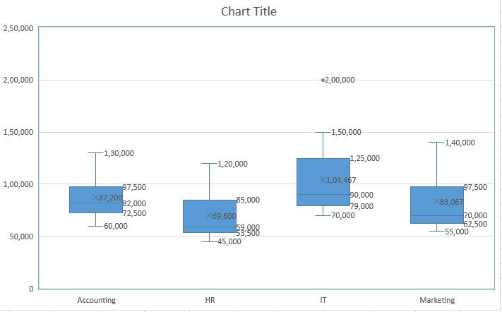
How to Interpret Boxplot in the above Example
Now here comes the most awaited section of this article….
Here we are going to interpret the above boxplot which represent the salary of 4 departments. Please refer the excel file and the above example.
Points to be noted
- Range:
- Accounting: 60,000 – 130,000
- HR: 45,000 – 120,000
- IT: 70,000 – 150,000 (excluding the outlier)
- Marketing: 55,000 – 140,000
- Interquartile Range (IQR):
- Accounting: 97,500 – 72,500 = 25,000
- HR: 85,000 – 53,500 = 31,500
- IT: 125,000 – 79,000 = 46,000
- Marketing: 97,500 – 62,500 = 35,000
- Median:
- Accounting: 82,000
- HR: 59,000
- IT: 90,000
- Marketing: 70,000
Insights:
- Here we can see that IT department has the highest median salary of 90000. Then comes Accounting (82000), Marketing (70000) and HR (59000) department in descending order. From this information we can say that IT department has the highest salary compared to other departments and HR department has the lowest salary.
- Another point we can see is, the range of salaries of IT department (excluding outlier) is very high among all departments, which indicates greater variability in salaries.
- Also there is an outlier at 200000 in IT department, which is very much higher than maximum salary of 150000 of that department. This points out that there is highly specialized executives role in IT department.
- HR department has the lowest minimum salary, which is 45000. This means HR department is giving lowest entry level salary than other departments.
- We can see Marketing and HR department have same Q3 values. But the median and Q1 values are different. This indicates the salary of marketing department is more positively skewed than the HR department. That means a higher proportion of employees are earning salaries above the median in Marketing department than HR department.
- The IQRs indicate the spread of the middle 50% of data. A larger IQR suggests a wider distribution of salaries. The IT department has the largest IQR (46,000), implying more variability in salaries within the middle 50% of employees compared to the other departments.
- The Accounting department has a relatively smaller interquartile range (IQR) compared to the other departments, suggesting a more consistent salary distribution among the middle 50% of employees in this department.
- The difference between the median and Q1 values for the IT department is greater than the differences for the other departments. This might suggest that the IT department has a wider distribution of salaries in the lower half, which could be due to varying levels of experience or expertise among employees.
- Comparing the median and minimum values, the IT department has a smaller difference than the other departments. This could indicate that entry-level positions in IT have relatively higher compensation compared to entry-level positions in the other departments.
In conclusion, the box plot reveals that the IT department has the highest median salary and the greatest variability in salaries. HR has the lowest minimum salary, while Marketing shows a more positively skewed salary distribution. The outlier in the IT department suggests the presence of highly specialized or executive roles with significantly higher salaries.
[wpdiscuz-feedback id=”j3y2gmnirh” question=”Please leave a feedback on this” opened=”0″]What do you think about his article. Let’s know or do you have anything more to add?[/wpdiscuz-feedback]How to identify Outlier while creating Boxplot
We use whiskers to identify outliers. Please refer this picture.
The first whisker is drawn from Q1 down to the the last point covered by the range Q1-1.5 x IQR.
Another whisker is drawn from Q3 to the last point covered by the range Q3+1.5 x IQR.
Data outside of these ranges are generally defined by convention as “outliers.”
While these outlier points may be interesting to look at, they should not be immediately trimmed and it is entirely possible that they should be there. This related article goes into depth about the creation of the “outlier” definition for this type of chart.
Other Boxplot Interpretations
As a visual 5-number summary, it is apparent that this is a non-parametric plot. That is, the plot does not rely on an underlying parameter distribution. This makes the plot robust for a wide range of data types.

When you look at a boxplot, a few aspects of the interpretation are obvious. First, there are the basic descriptive statistics:
- The center of the data via the median line.
- The spread of the data.
- the interquartile range.
- the range
- The skew of the data, depending on the location of the median, IQR, and whiskers.
Certainly the ability to rapidly identify these attributes, from a clean and simple plot, is why it is almost ubiquitous in statistical learning half a century after it was introduced.
It follows that the ability to quickly visually compare attributes within a data set is very powerful. It can further become immediately apparent which attributes would be worthwhile for further research, study, and hypothesis testing.
While the boxplot can be properly interpreted for many statistical aspects, this standard model hides sample size and the underlying shape of the data.
Interpretations of Boxplot Modifications
To aid in boxplot interpretation, additional modifications can be made to the basic plot. We will discuss the two most popular variations: variable width and notches.
The first type, variable width, uses widths which are proportional to the group size. The most popular version of this type uses the square root of the group size.
The second type of modification, notches, narrow the box at the median line. A common method uses ±(1.58 IQR)/(sqrt(n)). This results in larger notches for smaller data sets.
Another adaptation is to replace the usual 5-number summary with Tukey’s 7-number summary. This summary consists of the minimum, first octal, first quartile, median, last quartile, last octal, and maximum. One way to construct this summary is to find the median after each previous division.

The final, but least common variation is usually considered a completely different plot. Violin plots try to get around some limitations mentioned earlier. They do this by plotting a mirrored image of the kernel density plot. The density then provides a more detailed view of the shape of the data but obscures the summary statistics.
What a Boxplot is Not
Previously, we talked about what a boxplot is and how to interpret it. Part of proper interpretation is also knowing, what a boxplot is not. We will discus it here.
First, a boxplot is not a replacement for understanding the precise shape of your data. As previously discussed, it should not be a substitute for plots of individual points of data.
Second, a boxplot cannot and should not be used to test correlation. A marginal plot may use them to describe the shape of possibly correlated data. This is obviously done to reduce the total individual plots and not to enhance the possibility of correlation.
Third, a boxplot is not a substitute for summary statistics or additional data exploration. It is a tool to be used in exploratory data analysis.
Fourth, a boxplot is not a wholesale substitute for a strip chart, dotplot, histogram, or kernel density plot.
Fifth, a boxplot should lead you to asking more questions, not be seen as a way to answer all of your questions about a data set.
Finally, a boxplot is not a substitute for additional statistical analysis. This is true if you are using descriptive statistics, exploratory data analysis, or Bayesian statistics.
Boxplot Interpretation Conclusion
If you have never used a boxplot before, hopefully you now know how it can help you. You now know what a boxplot is, and what it is not.
[wpdiscuz-feedback id=”j3y2gmnirh” question=”Please leave a feedback on this” opened=”0″]If you have any questions or doubts about this type of plot or the other plots mentioned in this article, please leave a comment.[/wpdiscuz-feedback]
Now or Never
We’ve got your back on your manufacturing journey — Stay in touch
Follow us for step-by-step guidance, templates, and insights that save time and reduce mistakes.
Know Industrial Engineering Platform – Helping manufacturing industry professionals worldwide since 2019

Thank you for sharing