
Control charts are used to study the variation of process parameters over time. Hence, we can know whether the process is under statistical control or not. Under control means all of the variation is the result of common causes and that the process is behaving naturally. Out of control means that an assignable or special cause can be determined. Processes out of control can still be within tolerance and processes in control can still exceed tolerances.
There are different types of control chart and we will be discussing six types of control charts in this article. We will be discussing construction of the data for preparing control charts and also construction of the control chart with Microsoft Excel.
You can download the below excel file which have different types of control charts and those are editable.
An overview of this article


See how Factovare helps factories digitize work
Watch the demo and contact us to try Factovare for your manufacturing operations.
Free Training Registration
Factovare Certified Manufacturing Excellence Professional (FCMEP)
Trainer: Founder of Factovare and Know Industrial Engineering
Learn directly from the person behind both platforms.
What you will learn
Enter your details and verify email OTP to reserve your seat.
Step 1: Enter your name and email address, then click Send OTP.
- Introduction to Control Charts
- Types of Control Charts
- Control Charts for Variables data
- Control Charts for Attribute data
Introduction to Control Charts
Control Charts were developed around 1920 by Walter Shewhart. They are used to show the typical variation in a process (that is, “common cause” variation). This is done by plotting Key Process Indicator (KPI) statistics with an average for reference. Control Limits are then added at three standard deviations from that average. The center line and control limits can be calculated from historical data. When points fall outside of these limits, they indicate something unusual has occurred (that is, “special cause” or “assignable cause” variation).
The six Control Charts we will review all follow this same premise. As a result, the discussion of each is a bit redundant when considered as a whole. However, each of the charts has been hyperlinked to review just the chart you are interested in at the moment.
Control Charts are a way to listen to the Voice of the Process (VoP). The KPI, its average, and limits show the variation inherent in the system. W Edwards Deming demonstrated that approximately 94% of all variation is “common cause.” This allows employees to focus on the 6% of variation that is “special cause.” Engineering tolerances, or the Voice of the Customer (VoC), are never included on a Control Chart. That relationship is described with a histogram in Capability Analysis.
Control Charts are one of the 7 Basic Tools of Quality. As such, they are one of the fundamental tools of the trade. In this article, we will discuss the six basic Shewhart Charts or Control Charts that you may need to build in Excel. They are:
- x–MR (individual and moving range)
- x-bar–R (mean and range)
- c-chart (nonconformances)
- u-chart (nonconformances per unit)
- p-chart (fraction nonconforming)
- np-chart (number nonconforming)
Types of control Charts
You may have heard that there are two type of people: those who divide things into two categories and those who don’t. To keep things simple, we will start with looking at the two major divisions in Control Charts: charts for Variables Data and Charts for Attribute Data. We will also avoid: median, standard deviation, Cumsum EWMA, Rare-events, and trends Control Charts and the other sundry types.

Therefore, let us focus on Control Charts categorized into the following:
- Control Charts for Variables data
- Control Charts for Attribute data
Control Charts for Variables data
The first type of charts we are going to look at are for Variables data. This type of data is measurable on a continuous scale. While the sample data used is integers, it could be collected to any degree of precision that is appropriate for the tolerances. Determining the appropriateness of the data in relation to the tolerances is the job of a Measurement System Analysis (MSA).
- x–MR (individual and moving range)
- x-bar–R (mean and range)
Control Charts for Attribute data
The next group of charts we will discuss are those for attribute data. This raw data that is counted and always remains as integer values. In addition to the main division of attribute data, it can be divided into either defect data or defectives data.
The first type, defect data, is data that may have several issues before becoming a defect. For instance, a screen may have up to 3 bad pixels before the screen is declared defective. Another example would be an essay that may be acceptable with a minimum number of errors. The second type of data is defective data where any imperfection results in a failure. For example, a checking routing number is a defect if one digit is incorrect.
- Defect
- c-chart (nonconformances)
- u-chart (nonconformances per unit)
- Defectives
- p-chart (fraction nonconforming)
- np-chart (number nonconforming)
Construction of Control charts
In the following sections, we will provide the process required to convert the raw data (along with the data types required for each chart) into usable charts. We will discuss the creation of the control chart constants needed. Then we will examine each of the charts in the order listed above.
Sample File of Control Charts built in Microsoft Excel
To follow along with these examples, you can use this sample file:
Each section of this article corresponds to a tab within the spreadsheet.
Control Chart constants
First, we need to create a table of Control Chart constants. The charts we are creating define the constants that are required. That is, different control charts require different constants.
If all of the chart types are in a single file, then make a table with the Control Chart constants for all of the charts and pull the data repeatedly from this single table. While the sample file uses static calls, it is easily adapted to use =VLOOKUP() to make the charts increasingly dynamic but there is rarely a need for that complexity. There are hundreds of sources readily available in print or online to find the chart constants. All required values for these charts are included in this article.
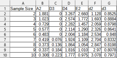
The table of constants should have the following values: A2, D3, D4, E2, d2. By adding d3 to the table, all other constants can be calculated from d2 and d3. Therefore to reduce transcription error, the final table should have this structure:
| Sample Size | A2 | D3 | D4 | E2 | d2 | d3 |
| n | =3/(d2*sqrt(n)) | =MAX(0, 1-3*d3/d2) | =1+3*d3/d2 | =3/(d2) | copied from table | copied from table |
The completed table in Excel will look like this: (note the values for the constants we will not calculate, d2 and d3).
Plotting Technique
The purpose of this section is to provide you with a detailed description of constructing the control charts in Excel. This technique will work with all of the control chart types covered in this article.
The columns are arranged in our file to make plotting tables easier. Consistency in setting up columns leads to consistency in creating plots. This, in turn, makes it easier to edit the plots for consistent results later. The arrangement I use here is: sample statistic, Lower Control Limit (LCL), Center Line (CL), and Upper Control Limit.
After selecting the data in these four columns with their label, Excel makes it easy to create a chart by selecting Insert -> Line or Area Chart. We want to be sure to select the version without markers. This is because it is easier to add markers to one line on the plot than to remove them from three lines on the plot.
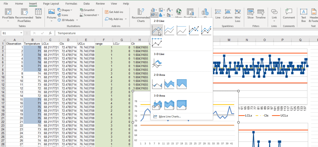
Once the chart is created, you can right-click on a line then select “Format Data Series…” to change the properties of each line.

This option opens a panel on the right side of the screen. The panel has a large number of options to choose from. The features of most concern are the Color (the LCL and UCL should match and it helps to make the CL and sample statistic different colors), Dash type (only the CL should be adjusted to something appropriate). Keeping this menu open, you can left-click each line in the control chart to modify its properties.
As a personal preference, I tend to like a red for the control limits (as they indicate a need for action when they are crossed) and a yellow or green for the center line (as it represents the expected output from the process). Finally, I tend to use a cool color (such as blue) for the sample statistic to offer contrast. Triad color schemes such as red, yellow, and blue tend to offer the most contrast in the colors while remaining readable and balanced.

Selecting the “Marker” option of the “Format Data Series…” menu lets you adjust the final feature of the control chart plots.

The easiest option is to select the “Automatic” option under “Marker options” to add markers to the sample statistic line in the control chart.
These edits then result in the consistent control charts presented here and provided in the sample file.
Control Charts for Variables data
x–MR (individual and moving range) Control Chart creation
In this section, we will construct the most basic of variable data Control Charts: the individual and moving range charts. These charts are best used when there is significant time between each observation.
As the name implies, we will need to create two charts: one for the individual values and one for the moving range. For the process to be in statistical control, both charts will need to be in control.
We will begin with a random set of data. For this set of examples, let us pretend to have daily indoor temperature data for 20 weeks. To simulate this data, we will be using the following formula: “=INT(NORMINV(RAND(),73,1.5))“. In other words, the formula makes a random value with a mean of 73°F and a standard deviation of 1.5°F. The prefix “INT” ensures we get an integer.
The resulting data of 140 observations can be arranged in the following manner. The highlighting helps make weeks visual.

Constructing the data tables
In this section, we will create the data tables from the observations generated previously.
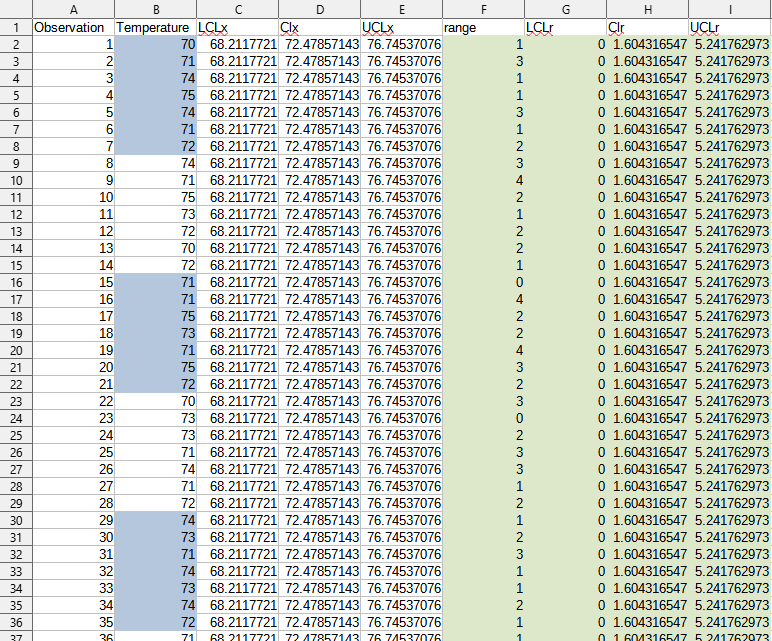
First, create the data to display the necessary lines: center lines (CL), lower control limits (LCL), and upper control limits (UCL). Remember, for the “Individuals” chart, the sample size is 1. The central line is the population mean of the values.
Next, ranges are calculated as the difference between adjacent values. This is the absolute value of the difference between the next value and current value. (For example, observation 2 minus observation 1 or observation 140 minus observation 139.)
After calculating the range, we will calculate “r-bar”, which is the sample mean of the ranges. This becomes the center line for the moving range chart.
Finally, the control limits are the “population mean ± E2*r-bar”.
Lastly, we calculate the control limits of the range. These are “D3*r-bar” and “D4*r-bar” as the LCLr and UCLr.
As a reminder, E2, D3, and D4 come from the Control Chart constants table we created earlier and are not cell locations in Excel. Because we are using a moving average of two values, the sample size for the data is 2.
From adding these formulas in Excel, we obtain the following results in the table:
Constructing the control charts
In this section, we will work on the next step: to plot the values as a set of graphs.
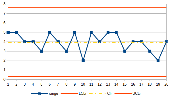
We will need to make two charts. The first chart is of the “Individuals” where “Temperature” is a line plot with markers. Next, we will add “LCLx”, “CLx”, and “UCLx” to the plot without markers, with the “LCL” and “LCL” having matching properties. For the second chart, the same process is followed with “range”, “LCLr”, “CLr”, and “UCLr”. The completed charts are as follows:


Both the Moving Range chart and the Individuals chart are in statistical control. Therefore, this particular random sample represents a stable process. Not every randomly generated set will meet these criteria.
x-bar–R (mean and Range) Control Chart creation
In this section, we will cover the creation of the second most popular Control Chart for variables data: the mean and range charts. Other versions we will not look at are the mean and standard deviation charts and the median and range charts.
The first consideration is that the means that are plotted in this type of chart are logical subgroups. The subgroups usually between 3 to 5 but limited to less than 10. There are additional chart types for subgroups larger than 10. They also require the constants table we constructed earlier to be expanded as well. For this example, a logical subgroup within a calendar year would be weeks. Because the laboratory is open every day, the weeks under consideration are a subgroup of 7.
Rather than creating new data for this chart, we will rearrange the data from the previous chart. The resulting transformed data will look like this:

Constructing the data tables
In this section we will cover creating the data tables for the mean and range charts.
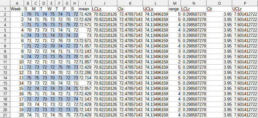
Similar to the previous charts, we will need to create center lines, upper control limits, and lower control limits. This time, we will also need to calculate the mean and range for each subgroup.
First, we start with the population mean for each subgroup. (That is, we want the sum of all the values divided by the count of all the values). Then we calculate the range. This is easily done by using the formulas to subtract the minimum value from the maximum value.
Next, create the data to display the necessary lines: center lines (CL), lower control limits (LCL), and upper control limits (UCL). Remember, for this “mean” chart, the sample size is 7. The central line is the population mean of the previously calculated subgroup means. This value is often represented as x with two bars over it or as “x-bar-bar”.
After calculating the range, we will calculate “r-bar”, which is the sample mean of the ranges. This becomes the center line for the “range” chart.
Finally, the control limits are the “x-bar-bar ± A2*r-bar”.
Lastly, we calculate the control limits of the range. These are “D3*r-bar” and “D4*r-bar” as the LCLr and UCLr.
As a reminder, A2, D3, and D4 come from the Control Chart constants table we created earlier and are not cell locations in Excel. Because we are using a subgroup to represent a week, the sample size for the data is 7.
From adding these formulas in Excel, we obtain the following results in the table:
Constructing the control charts
In this section, we will work on the next step: to plot the values as a set of graphs.
We will need to make two charts. The first chart is of the “means” where “Temperature” is a line plot with markers. Next, we will add “LCLx”, “CLx”, and “UCLx” to the plot without markers, with the “LCL” and “LCL” having matching properties. For the second chart, the same process is followed with “range”, “LCLr”, “CLr”, and “UCLr”. The completed charts are as follows:

Both the Range chart and the Means chart are in statistical control. Therefore, this particular random sample represents a stable process. Not every randomly generated set will meet these criteria.
Control Charts for Attribute data
Defect Data Control Charts (c and u)
The next two types of charts, the c-chart and the u-chart both plot defect data of their respective KPIs.
c-chart (constant sample size of defect data control chart)
In this section we are looking at the c-chart. This type of chart is developed from counts of defect data. That is, each count represents an issue. However, each unit may have multiple issues before being classified as defective. As a result, c can be greater than the sample size n. In this example, we will pretend we are looking at water spots on car windshields.
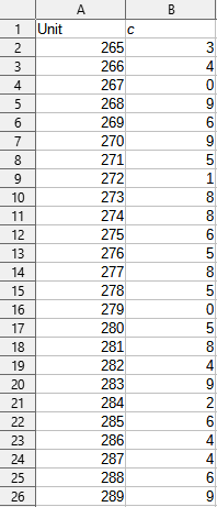
A table of such values might look like the following:
Constructing the data table
In this section we will complete the data table. For this type of chart, the limits are very straight forward.
First, we calculate the center line or c-bar. This is simply the sum of all the counts divided by the number of items counted.
Next, we construct the control limits. For this type of chart, the limits are: c-bar ± 3*sqrt(c-bar). Because this might result in negative limits for count data, we will use the formula “=MAX(0,cbar-3*SQRT(cbar))” for the lower control limit.
The completed data table will look like this:

Constructing the control chart
In this section we will complete the process by plotting the chart.
Similar to the other charts we have made, the LCL and UCL will have matching properties. In addition to the control limits, the CL will have markers removed. Finally, the counts will be a line with markers.
The finished result should look like this:

Despite being randomly generated, this data also describes an in-control process.
u-chart (nonconformances per unit control chart)
In this section we are looking at the u-chart. This type of chart is developed from counts of defect data. That is, each count represents an issue. However, each unit may have multiple issues before being classified as defective. In this example, we will pretend we are looking at water spots on car windshields. Unlike the c-chart data, the sample size varies each day. This variation leads to variable control limits, which will be explained as we fill out the rest of the data table. It is also worth noting that if there is minimal variation in the subgroup size we can opt to simply use a c-chart instead.
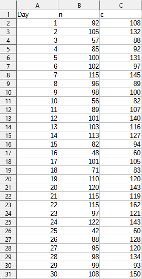
A table of such values might look like the following:
Constructing the data table
In this section we will complete the data table. For this type of chart, the limits are very straight forward, even though they will vary.
First, we need to calculate the defects per unit. This is done by dividing the defects, c, by the number of units, n. This results in the new variable u.
Next, we calculate the center line or u-bar. This is simply the sum of all the nonconformances per unit divided by the number of items counted.
After calculating the center, we construct the control limits. For this type of chart, the limits are: u-bar ± 3*sqrt(u-bar/n). Because this might result in negative limits for count data, we will use the formula “=MAX(0,ubar-3*SQRT(cbar/n))” for the lower control limit.
The completed data table will look like this:

Constructing the control chart
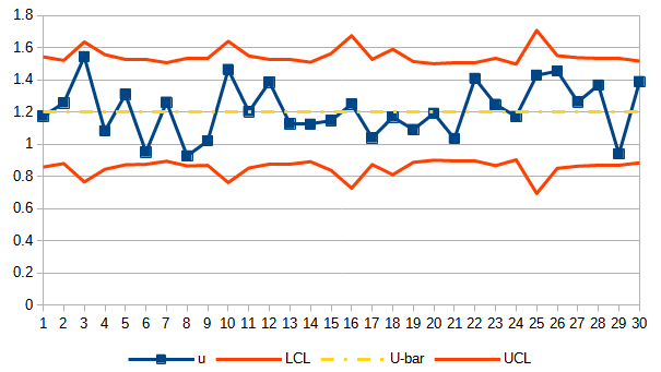
In this section we will complete the process by plotting the chart.
Similar to the other charts we have made, the LCL and UCL will have matching properties. In addition to the control limits, the CL will have markers removed. Finally, the counts will be a line with markers.
The finished result should look like this:
Defectives Data Control Charts (p and np-charts)
The next two sections will cover the creation of p-charts and np-charts, which are based on defectives data from their respective KPIs.
p-chart (fraction nonconforming control chart)
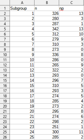
In this section we are looking at the p-chart. This type of chart is developed from fraction defective data. That is, each np represents a defective unit and each n represents the total number of units. Because this is defective data, each unit can only be good or bad. As a result, np must be less than or equal to n. For the data to be meaningful, the sample size should be greater than 50 but the sample size is not constant. In this example, we will pretend we are looking approved engineering changes.
A table of such values might look like the following:
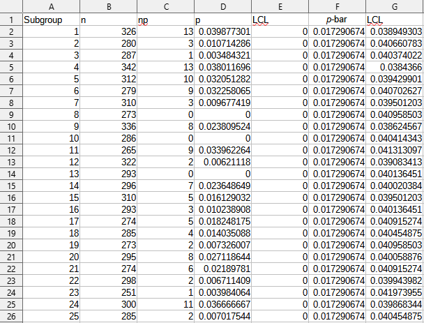
Constructing the data table
In this section we will complete the data table. For this type of chart, the limits are very straight forward, even though they will vary.
First, we need to calculate the defectives per unit. This is done by dividing the defectives, np, by the number of units, n. This results in the new variable p.
Next, we calculate the center line or p-bar. This is simply the sum of all the defectives per unit divided by the number of subgroups.
After calculating the center, we construct the control limits. For this type of chart, the limits are: p-bar ± 3*sqrt(p-bar*(1-p-bar)/n). Because this might result in negative limits for the ratio that should be between 0 and 1, we will use the formula “=MAX(0,pbar-3*SQRT(pbar*(1-pbar)/n))” for the lower control limit. Because the control limits rely on the variable sample size, the control limits vary as well.
The completed data table will look like this:
Constructing the control chart
In this section we will complete the process by plotting the chart.
Similar to the other control charts we have made, the LCL and UCL will have matching properties. In addition to the control limits, the CL will have markers removed. Finally, the counts will be a line with markers.
The finished result should look like this:

Note, in this chart that day 1 is out of control despite the same number of defectives for day 1 and 4. This is because the sample size changed between days. If the variable control limits are too distracting and the variation minimal, you can use an average count and create an np-chart instead.
np-chart (number nonconforming control chart)
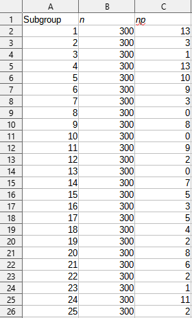
In this section we are looking at the np-chart. This type of chart is developed from the number defective data. That is, each np represents a defective unit and each n represents the total number of units. For this type of chart, there is no variation in the sample size. Because this is defective data, each unit can only be good or bad. As a result, np must be less than or equal to n. For the data to be meaningful, the sample size should be greater than 50. In this example, we will pretend we are looking approved engineering changes, using a constant n and the same np values as the example for p-charts..
A table of such values might look like the following:
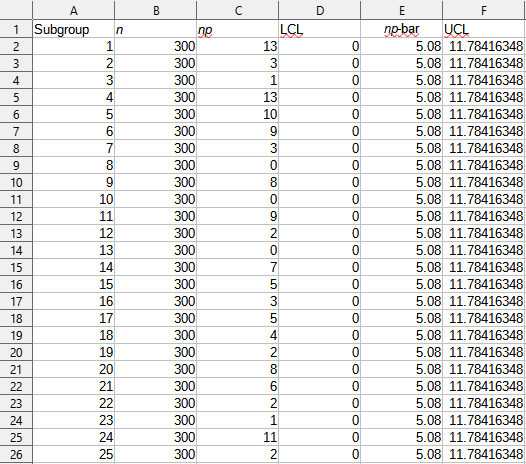
Constructing the data table
In this section we will complete the data table. For this type of chart, the limits are very straight forward.
First, we calculate the center line or np-bar. This is simply the sum of all the defectives divided by the number of subgroups.
After calculating the center, we construct the control limits. For this type of chart, the limits are: np-bar ± 3*sqrt(np-bar*(1-p-bar)). We will use np-bar/n to calculate p-bar in the formula. Because this might result in negative limits for the ratio that should be between 0 and 1, we will use the formula “=MAX(0,npbar-3*SQRT(npbar*(1-npbar/n)))” for the lower control limit.
The completed data table will look like this:
Constructing the control chart
In this section we will complete the process by plotting the chart.
Similar to the other control charts we have made, the LCL and UCL will have matching properties. In addition to the control limits, the CL will have markers removed. Finally, the counts will be a line with markers.
The finished result should look like this:

Note, in this chart that day 1 and day 4 are out of control with the same number of defectives for day 1 and 4. This is because the sample size remained the same between days. The reduced count (n) resulted in wider control limits in the p-chart, thus showing day 4 in control.
Conclusion
This has been a sample of the six most common types of Shewhart charts or control charts. If these do not fit your needs, do not despair! A large number of additional control charts, such as those in the flowchart above, have already been developed that may fit your needs exactly.
It is our hope that with this sample file and set of instructions, you will have the skills necessary to construct any control chart you may need in the future.
Now or Never
We’ve got your back on your manufacturing journey — Stay in touch
Follow us for step-by-step guidance, templates, and insights that save time and reduce mistakes.
Know Industrial Engineering Platform – Helping manufacturing industry professionals worldwide since 2019

Well articulated blog👌