Many of us have heard about the term Pareto Analysis or Pareto Chart or 80-20 rule. But, what is the meaning of it? And how to use it in our day to day life?
This article explains about the Benefits of Pareto analysis, How to use it with Demonstration and how we can utilise it in our daily activities.
First of all we will see the history of Pareto chart:
History of Pareto chart


See how Factovare helps factories digitize work
Watch the demo and contact us to try Factovare for your manufacturing operations.
Join our manufacturing community and grow with manufacturing professionals worldwide
Join our WhatsApp group for networking, or write manufacturing articles and earn through your knowledge.
Origin: The principle of Pareto goes way back to 1897, when Vilfredo Pareto used the 80-20 rule to represent the distribution of wealth in Italy. He observed that 20% of Italian population possesses 80% of the Land and wealth of the country.
Later on, Joseph M. Juran named the principle “PARETO” after the Italian economist Vilfredo Pareto in 1941.
Pareto Chart is one of the 7 tools of the Quality Management.
Different names of Pareto analysis
- Pareto Principle
- 80-20 rule
- Law of the vital few
- Principle of factory sparsity
Principle of Pareto Analysis
It states that the 80% of problems/effect are caused by 20% of the causes. In short, the purpose of the chart is to find the most important/critical factor from the set of many other factors.
Examples:
- 80% of manufacturing defect comes by 20% of human error
- 80% of road accidents occurs by 20% of drivers
- 80% wealth belongs to 20% of population
- 20% employee contributes to 80% of revenue
- 20% of time spent on work gives 80% results
Benefits of Pareto Analysis
- Separate the problem and causes
- Helps to focus on the right problems
- Enhance the decision making skills
- Improves problem solving skills
- Increases the efficiency of work
- Saves time
Now that we know the principle and benefits of it, let us see how to prepare the Pareto chart and what the data that needs to be collected are.
How to make Pareto chart
Pareto chart is prepared majorly in Microsoft Excel and Minitab.
We will illustrate the chart in Microsoft excel.
Let us take an example of a printing press. So, there is a printing press and during the process of printing, there are various defects that occurs on the paper.
Step 1
The first step will be to collect the data of all the defects and the number of time it occurs on paper in one set of operation. Example is shown in table below.
| Problem category | Number of occurrence |
| Cross Printing | 13 |
| Dusty spot on paper roller | 23 |
| Folded edges | 180 |
| Incorrect shade | 79 |
| Ink Adjustment | 12 |
| Multiple units colour adjustment | 7 |
| Torn piece of paper on roll | 41 |
| Wrinkles | 14 |
| Total | 369 |
As shown in the above table, there are various defects that occurred during the printing of paper and in the other column there are Number of Occurrence i.e. the total number of time it occurred on the paper.
Note: Number of occurrence can also be named as frequency
Step 2
The next step will be to arrange the Occurrence in descending order and make other two column of Cumulative and Cumulative percentage
| Problem Category | Occurrence | Cumulative | %Cumulative |
| Folded edges | 180 | 180 | 49% |
| Incorrect shade | 79 | 259 | 70% |
| Torn piece of paper on roll | 41 | 300 | 81% |
| Dusty spot on paper roller | 23 | 323 | 88% |
| Wrinkles | 14 | 337 | 91% |
| Cross Printing | 13 | 350 | 95% |
| Ink Adjustment | 12 | 362 | 98% |
| Multiple units colour adjustment | 7 | 100% | |
| Total |
To calculate cumulative numbers, we have to add each occurrence from occurrence table to the sum of its predecessors.
Example: The first number i.e. 180 (in cumulative column) will remain same, while the second number 259 = 180 (in cumulative column) + 79 (Incorrect shades) and again 300 = 259 (cumulative number) + 41 (Torn piece of paper) and so on.
Note: The last number in cumulative column will always be same as the total number of occurrence. In this case 369 is the number which will be same in final cumulative column as well as total occurrences.
Similarly, also calculate the % cumulative.
To calculate cumulative percentage: Cumulative number/Total number of occurrence
For example: for, 49% = 180/369 and so on.
Step 3
The next step will be to prepare Pareto chart. Go to Insert – select column chart. After clicking on the column chart, white chart space will open. Right click on it and ‘Select data’. After clicking on select data, the below screen will occur.

Select the column of ‘Problem category’ and ‘Occurrence’ together. Insert comma (,) in Chart data range and select ‘Cumulative percentage’ column.
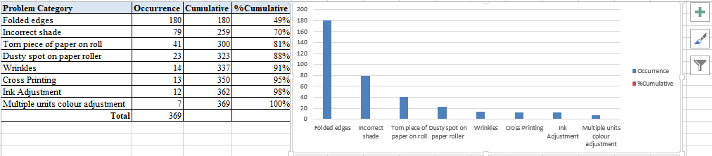
Your Pareto chart will be displayed like the above image.
Step 4
Now that the main Pareto chart is prepared, it is time to edit and make it more visible and easy to understand.
Right click on the red %cumulative and click on “Change series chart type”. After clicking on it, a new dialog box will open. In the drop down in front of %cumulative choose “line with marker” and then click OK

Step 5
After the above step, right click on the red line in the chart and click on “Format data labels” and select secondary axis.

The above image shows the almost completed Pareto chart. You can right click on the blue columns and add labels and also edit the position of it. Also you can do same for %cumulative axis by right clicking and add labels. One can easily change colour, font size and position of the numbers
Step 6
The next step will be to display the defects which contributes to the 80% of the problems, for that go to Insert- shape and select any suitable shape and highlight the chart up till 80%.

One can easily see in the above chart that 80% problems are highlighted as “Vital few”, meaning three main defects are contributing to the 80% of the problems in the printing press.
The next step will be to do brainstorming, analyse the problem and get suitable solution using Root cause analysis.
Pareto charts in Excel
You can download the pareto chart excel template here.
Thank you
If you know any subject that can be related to manufacturing industry or industrial engineering, you can earn some income by becoming article contributor of this website. For knowing more about it, please visit Join us page.
You don’t need to have any experience in article writing, just knowledge on the subject is needed.
Also you can know more about our team of article contributors by visiting the about us page.
About the Author

Jay Desai has over 4 years of experience in Lean Six Sigma, Operations Management and Production Engineering. A post graduate in Computer Integrated Manufacturing from Nirma University. He has successfully delivered Lean deployment, training and project coaching at many levels within customers organization as well as delivered educational programmes.
Latest articles from Know Industrial Engineering
- Manpower Calculation Software for ManufacturingManpower Calculation Software for Manufacturing: Why Factories Need a Smarter Way to Plan People In manufacturing, manpower is not just a number. It directly affects production output, delivery performance, overtime cost, machine utilization, line efficiency, and customer satisfaction. Many factories still calculate manpower requirements manually using Excel sheets, assumptions, old standard times, or last month’s… Read more: Manpower Calculation Software for Manufacturing
- Manpower Planning SampleManpower planning is one of the most important activities in manufacturing. If manpower is planned wrongly, the factory may face production delays, excess labour cost, poor line balance, overtime, or underutilization of people. Many companies still plan manpower based on experience or rough assumptions. But for better productivity, manpower should be planned using proper data… Read more: Manpower Planning Sample
- Factory Productivity Improvement Tools: The Smarter Way to Improve Manufacturing PerformanceIn modern manufacturing, productivity is no longer improved by effort alone. It improves when factories use the right systems, tools, and data to make faster and better decisions. This is why factory productivity improvement tools are becoming essential for manufacturers that want to reduce inefficiencies, improve output, and stay competitive. Looking for factory productivity improvement… Read more: Factory Productivity Improvement Tools: The Smarter Way to Improve Manufacturing Performance
- Industrial Engineering Is Entering Its Golden Hour – Here’s What’s Really ChangingThis article is written by Shivani Kadam. She is experienced in Project Management. For years, Industrial Engineering was seen as the field that kept factories running smoothly, cuts waste and made workflows cleaner. Important work, yes but honestly, it often stayed behind the scenes. In this article lets discuss how Industrial Engineering is entering its… Read more: Industrial Engineering Is Entering Its Golden Hour – Here’s What’s Really Changing
- How AI is quietly reshaping Industrial EngineeringThis article is written by Shreya Desai. She is experienced in Process improvement. Let’s discuss about Artificial Intelligence and Industrial Engineering. Over the past few years, I’ve noticed something interesting on the shopfloors….It’s not loud.It’s not flashy.It’s not even obvious at first glance. But you can feel it. AI is slipping into industrial engineering, and… Read more: How AI is quietly reshaping Industrial Engineering
- Career transition from automotive to solar module manufacturingThis article is written by Ashish Gaurav Chaturvedi. Ashish is Operations & Production professional. Here we will be discussing Career transition from automotive to solar module manufacturing. I started my professional journey in the automotive industry. My role involved working on production lines, quality control, design for manufacturing, and taking part in continuous improvement efforts.… Read more: Career transition from automotive to solar module manufacturing
- Adaptive Project Management in an Uncertain EconomyThis article is written by Shivani Kadam. She is experienced in Project Management. Adaptive project management is, moving towards the right or desired outcome, even if the path turned into something completely different from the original plan. I once ran a project that looked flawless from the outside, the kind you’d happily showcase in a… Read more: Adaptive Project Management in an Uncertain Economy
- How Value Stream Mapping Uncovered a Hidden Defect on the LineThis article is written by Shreya Desai. She is experienced in Process improvement. In a manufacturing plant, not all problems make noise. Some hide in plain sight. Idle operators, partially filled racks, or a batch of components waiting for someone to notice them. These quiet signs are symptoms of process inefficiencies that cost time, money,… Read more: How Value Stream Mapping Uncovered a Hidden Defect on the Line
- Machine Hour Rate (MHR)The Machine Hour Rate refers to the total expense associated with operating a particular machine for one hour. It includes both fixed and variable costs associated with operating the machine. By calculating this rate, factories can accurately determine how much it costs to produce a part or complete a job, especially when machine time is… Read more: Machine Hour Rate (MHR)
- Predetermined Motion Time System (PMTS)This article is contributed by Umang Kumar Singh. Predetermined motion time system (PMTS) is a method of arriving Standard time of a work, that comprises predetermined time values corresponding to each and every work element. When we talk about Industrial engineering, work measurement plays a crucial role for measuring productivity and reducing operational costs. As… Read more: Predetermined Motion Time System (PMTS)
- Karakuri in ManufacturingThis article is written by Shreya Desai. She is experienced in Process improvement. Karakuri in manufacturing refers to smart, mechanical solutions that harness basic physical principles like gravity, levers, springs, pulleys, and counterweights to support operators and streamline tasks—without relying on electricity, motors, or automated systems. What’s the coolest automation you’ve seen? Maybe a robotic… Read more: Karakuri in Manufacturing
- Role of Industrial Engineer in unionized manufacturingThis article is written by Umang Kumar Singh. The role of an Industrial Engineer in a unionized manufacturing environment is unavoidable, as it clear misunderstandings among workers, align both workers and management with company goals, and strengthens the relationship between them. Everyone knows Industrial engineering as Resource Allocation Optimizer, Waste Reducer and Process Efficiency Increasing… Read more: Role of Industrial Engineer in unionized manufacturing
- Digital twins in manufacturingThis article is written by Shreya Desai. She is experienced in Process improvement. What If Your Assembly Line Had a Mind of Its Own? A system on your shop floor that not only sees—but senses. One that learns your bottlenecks before your planners do. That catches torque drift before QA flags it. That knows what’s… Read more: Digital twins in manufacturing
- Process Capability IndexThis article is written by Shreya Desai. She is experienced in Process improvement. Let’s talk cookies—yes, the kind you bake. Imagine you’re baking a batch, aiming for uniform size, shape, and that perfect golden brown. But occasionally, a few turn out too flat, too big, or just a tad burnt. That inconsistency is what we… Read more: Process Capability Index
- Teamwork in Manufacturing: How an Industrial Engineer and Friends Revived a FactoryIn the fast-paced world of manufacturing, where deadlines are tight, margins are thin, and pressure is constant, it’s easy to believe that only hard data and systems drive success. But sometimes, what truly turns things around is leadership built on trust, friendship across departments, and the silent strength of a well-bonded team. At the center… Read more: Teamwork in Manufacturing: How an Industrial Engineer and Friends Revived a Factory
- Uses of Why-Why analysis in 5S ImplementationWhy-Why analysis tool is used in 5S Implementation, to find the root causes of problems. Why-Why analysis will be useful in following stages of 5S Implementation. We shall check in detail how we are using in each stage. Why-Why analysis in Shine Phase In Shine phase following activities are also done. Please note the following… Read more: Uses of Why-Why analysis in 5S Implementation
- How Industrial Engineers WorkIndustrial Engineers makes things better than anyone and they have a secret way of working to achieve this. Wondering How exactly do industrial engineers work? What systematic approach do they follow to bring improvements in factories, offices, hospitals, and even in services? Lets discuss in this article. Let’s break down their method into simple stages… Read more: How Industrial Engineers Work
- Career Growth Tips for Young Professionals from a General ManagerIn this article, we will be sharing career growth tips from Bairy Venkata Ugendhar and following are the short introduction about him, before we start. Bairy Venkata Ugendhar GM – Industrial Engineering Operations | 28+ Years in Manufacturing With over 28 years of hands-on experience across apparel, consulting, machine tools, and finance industries, Mr. Ugendhar… Read more: Career Growth Tips for Young Professionals from a General Manager
- Manufacturing in SpaceIf you are reading this article in 2025 -2030, you may feel little awkward on the topic ‘manufacturing in space’. But, in future it will be a necessity. Manufacturing in space, is the process of producing or manufacturing products in space to overcome the effect of Earth gravity during the manufacturing process.
- Standard Work Instruction (SWI) for Manpower OptimizationThis article is contributed by Ashish Rathore. He is presently driving continuous improvement projects and he is a Mechanical Engineer with MBA in HR and marketing Standard Work Instruction (SWI) is a document which is displayed in the work station which helps operator to do the work considering quality, productivity and safety. In this article… Read more: Standard Work Instruction (SWI) for Manpower Optimization
- How and Why to eliminate the concept of “Working hours”The debate around working hours and work-life balance is louder than ever. But let’s pause and ask—do hours really matter if you love what you do? When employees truly enjoy their work or feel like the company is their own, work stops feeling like a burden. They don’t count hours; they focus on results. The… Read more: How and Why to eliminate the concept of “Working hours”
- Proposal Writing and Bid writingProposal writing and Bid writing is a very important and a very critical skill that encompasses business, government, and different sectors including the IT and also the non-IT sectors. It involves writing well-structured documents that provide solutions to the requirements and also address all the problems that the client requires. In this article we will… Read more: Proposal Writing and Bid writing
- How to prioritize machines and activities for implementing SMEDThis article is written by Bharathkumar Radha Krishna. He is an Industrial engineer with expertise in lean methodologies and value stream mapping In this article, we will dive deeper into SMED. We will discuss how to prioritize machines and activities for implementing SMED, define economic lot size quantity, and will provide tips and techniques. In… Read more: How to prioritize machines and activities for implementing SMED
- Single-Minute Exchange of Die (SMED)This article is written by Bharathkumar Radha Krishna. He is an Industrial engineer with expertise in lean methodologies and value stream mapping In today’s manufacturing world, efficiency and productivity are the important keys to success. Every minute counts, which is why every organization is constantly seeking ways to improve or optimize their operations. Imagine a… Read more: Single-Minute Exchange of Die (SMED)
- How to add dimensions in AutoCADWe all know that AutoCAD is a powerful tool for drafting and designing and it is widely used in various fields such as engineering, construction, architecture etc. If you want to learn more about AutoCAD you can check the articles here. In today’s article, we are going to talk about a very important tool that… Read more: How to add dimensions in AutoCAD
- What will happen if you don’t hire an Industrial EngineerIf you don’t hire an industrial engineer, you might be missing out on a crucial opportunity to optimize your business processes, improve efficiency, and ultimately save both time and money. Industrial engineers are professionals who specialize in finding ways to make systems and processes work better. Here are some compelling reasons why hiring an industrial… Read more: What will happen if you don’t hire an Industrial Engineer
- Why a candidate with Industrial Engineering background is most suitable to lead a factoryI prefer candidates with an Industrial Engineering background to lead factory Operations or similar higher roles for several below compelling reasons. In addition to their traditional responsibilities, an individual with this background brings unique skills and perspectives to the role, fostering enhanced efficiency and innovation across the entire organization. Industrial Engineers are adept at optimizing… Read more: Why a candidate with Industrial Engineering background is most suitable to lead a factory
- Unit Per People Hour (UPPH)Unit per people hour is a measure of manhour used for manufacturing a product. It is abbreviated as UPPH. In this article lets discuss some formulas related to this and the uses of UPPH. At the end of this article you will be able access an online tool related UPPH, where you can enter the… Read more: Unit Per People Hour (UPPH)
- Unit Per Hour (UPH)Unit per hour is a measure of capacity of manufacturing or assembly line in a factory. Unit per hour is abbreviated a UPH. UPH means, how many units a manufacturing line or assembly can be produced in an hour. Let’s discuss this in detail. We will include following in this article. You may refer a… Read more: Unit Per Hour (UPH)
- How to grade operators in a factory and WhyGrading of the operators is categorizing or grouping the operators according to the various factors which is essential to do the job. In this article we will be discussing on how to grade operators along with the factors to be considered. So, stay tuned… We are explaining everything with practical examples. Before moving to our… Read more: How to grade operators in a factory and Why
Now or Never
We’ve got your back on your manufacturing journey — Stay in touch
Follow us for step-by-step guidance, templates, and insights that save time and reduce mistakes.
Know Industrial Engineering Platform – Helping manufacturing industry professionals worldwide since 2019
Informative Article..
Thanks for showings steps and template
Gives good insight for Pareto analysis and simply explains the basic elements.
Very informative article..
Very informative article.
Amazing stuff… good information!
This is a great article. Very informative and well-written.